
Cambridge Local First Team Assists Local Businesses Through Data-Driven Analysis
Introduction
Our Cambridge Local First Team completed three data visualization projects.
The biggest project was building this interface, which explores the correlation between business lifetime and other success factors of local and independent Cambridge businesses.
The team generated visualizations for this report about user engagement on the Cambridge Local First website.
The group created survey-response-based infographics showing the results of two national surveys about ongoing national policy campaigns.
Case Team Lead, Nikhil Dharmaraj ‘23, worked with Will Cooper ‘23, Robin Robinson ‘22, and Rinki Deo (Postdoctoral Fellow) on these projects.
Methodology and Findings
Project 1: Correlation Visualization Interface
Rinki Deo (Postdoctoral Fellow) sought to examine the relationship between the vitality of local and independent businesses in Cambridge and various factors that might correlate with their success, such as property land value, exterior occupancy, and sales volume. Deo collected data from the tools infogroup, the Center for Geographic Analysis at Harvard University, Cambridge Open Data, and Cambridge Local First’s local business and membership database. To clean the datasets, they flagged local businesses using geocode addresses. Then, they standardized business names by comparing entries from CLF and the infogroup. Since Cambridge Local First was interested in local commercial properties, team members used the Cambridge Property Database to filter out observations in the dataset. They created a list of proxies that would indicate business vitality, such as Year Established, Yearly Sales Volume, and Property Sale Date. Once the data wrangling was complete, the team generated violin and box plots for statistical visualizations and divergent bar plots and correlograms to display vitality correlations. The team found little correlation between business lifetime (i.e. the number of years in business) and numerical variables, including interior living area, sales volume, and number of employees.
Project 2: User Engagement Analysis
Will Cooper ‘23 investigated user engagement, examining both Cambridge Local First’s social media accounts and website. To measure website engagement, the team used tools such as Google Analytics, Facebook Insights, and Jetpack. Then, the team created insightful visualizations through development of custom Python scripts, using packages such as matplotlib, pandas, and numpy. The team observed indicators such as viral reach, trends in likes, trends in topics, and likes by demographic.
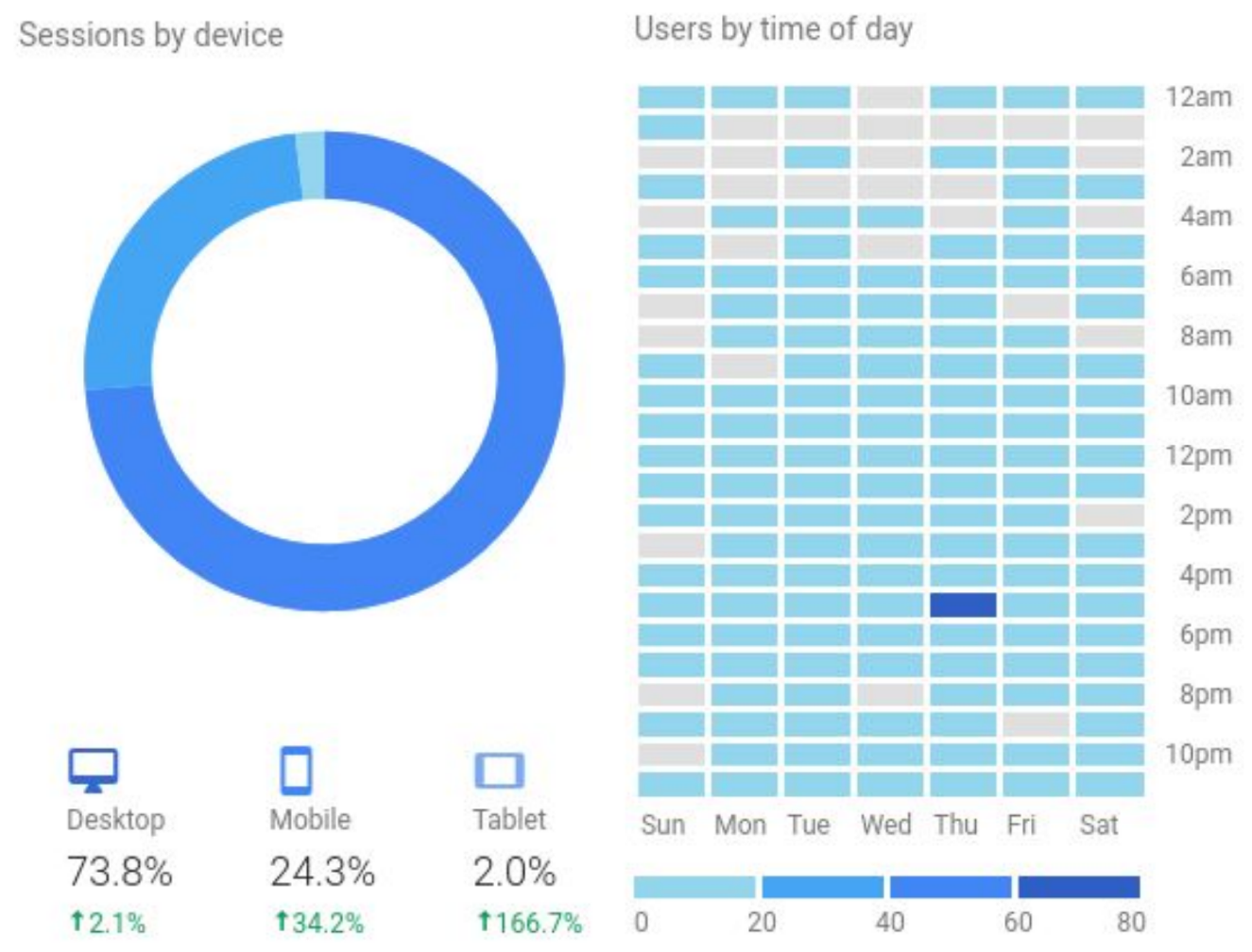
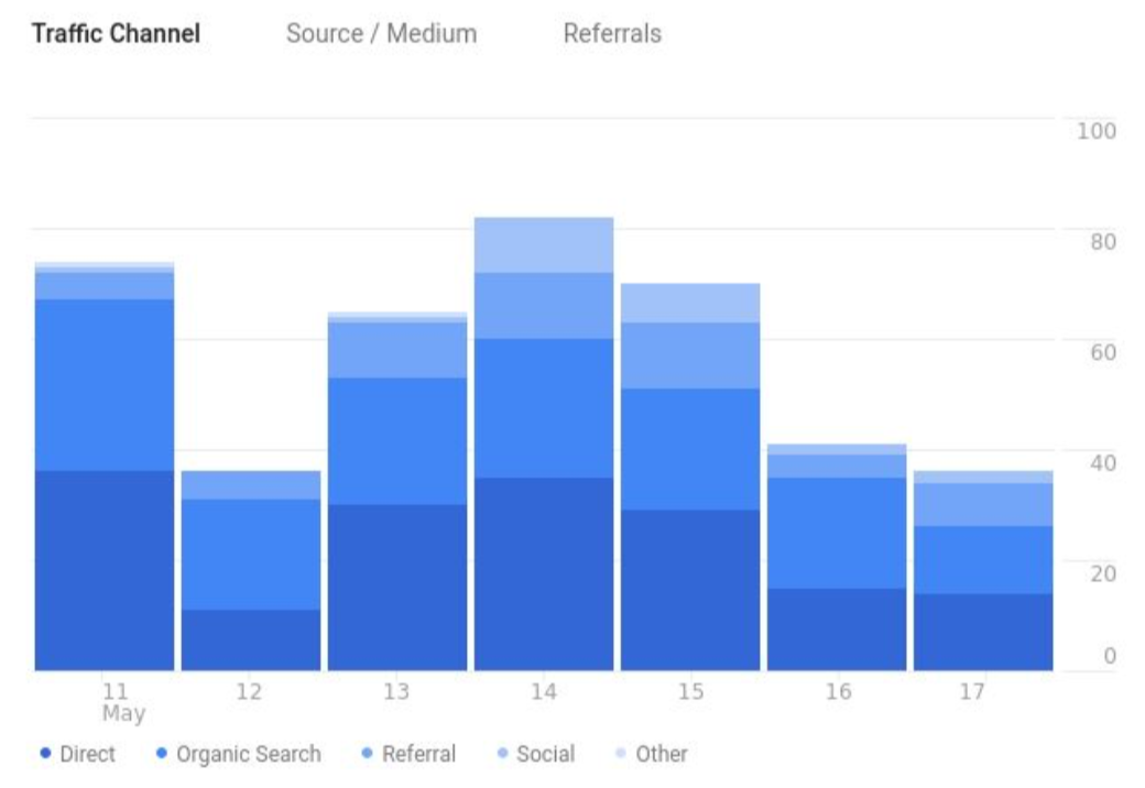
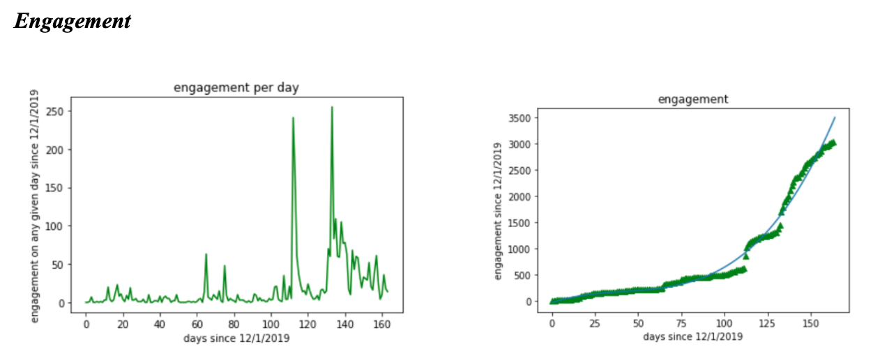
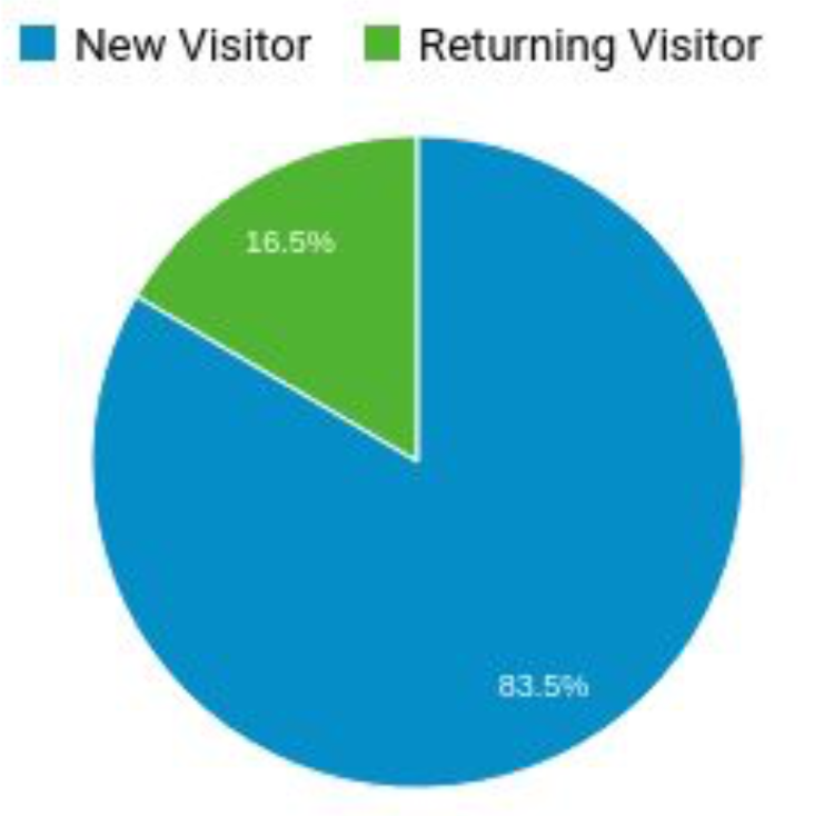
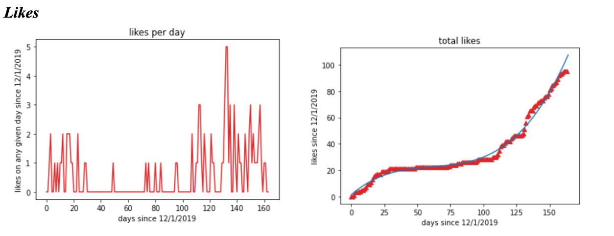
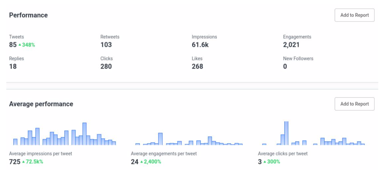
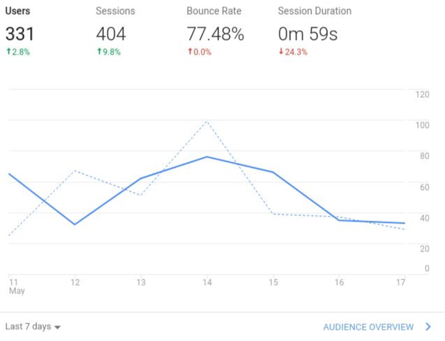
These visualizations revealed a variety of insights, including trends in user retention and new user interest in CFL’s website, key Twitter engagement metrics (e.g. tweets, impressions, clicks), frequently accessed user devices, and times of day with the heaviest website traffic.
The team noted that there was a clear upwards trend in user engagement across all CLF platforms, likely because Internet usage had increased during the pandemic. Since the beginning of May, this uptick in engagement has slowed. As a next step in user engagement analysis, the team recommends targeting specific demographics as well as investigating Facebook’s unique spikes in engagement.
Project 3: Infographic Generation
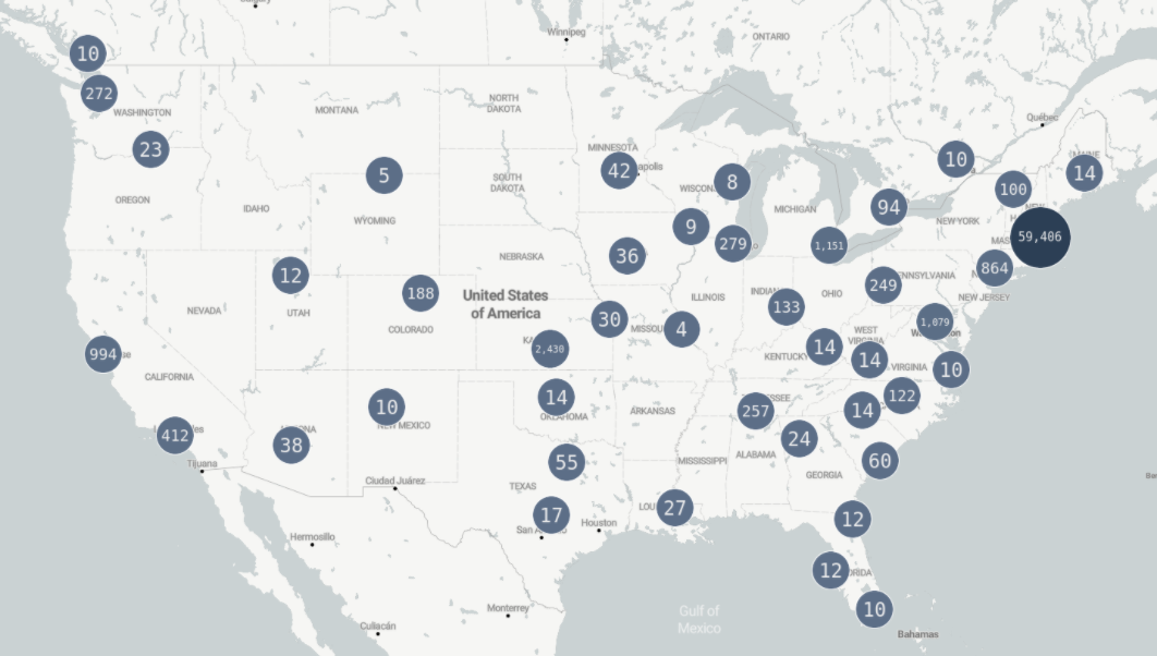
Robin Robinson ‘22 led the team’s work on the infographic deliverable. This project was based on data from the “Save Our Economy Now!” petition.
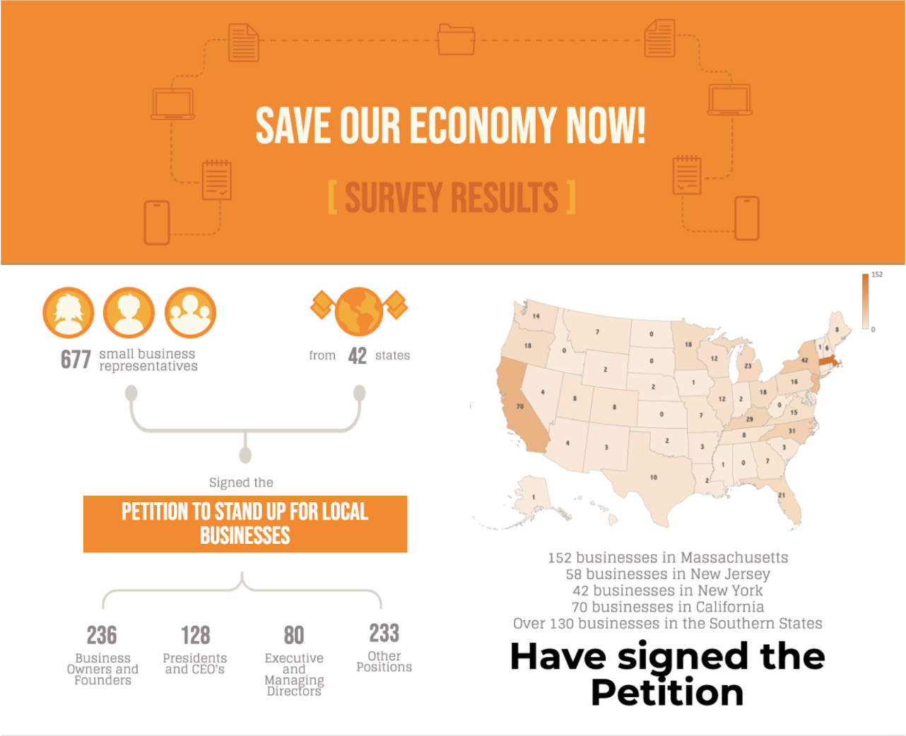
The group used Excel to build a heat map showing Massachusetts’ statewide participation frequency relative to other parts of the country. The team also grouped the participants by professional title (e.g. Business Owners, CEOs). Generally, project 3 helped CLF visualize the states (e.g. MA, CA) with the greatest number of participants.
For a separate visualization, the team also used Google My Maps to map each participating CFL member organization. This map is accessible here. This Google Maps visualization demonstrates that a large number of CFL members are clumped in one region of the city.
Case Team Leader Nikhil Dharmaraj ‘23 enjoyed the process: “Overall, my team gathered many insights from work on these projects. We all learned many technical tools, from data cleaning to Python visualization. On a broader level, we learned much about the importance and precarious economic status of local businesses in Cambridge (critical right now during the time of pandemic). My experience with the team was wonderful. I had a fantastic experience overall, and I hope to continue working on partnership projects through HCDAG in the future.”
This article reports the work of Harvard Data Analytics Group’s COVID-19 Crisis Response Team. Edited by Kelsey Wu.